- August 7, 2018
- Posted by: Tim McDaniel
- Category: How-To

Ever since the Onboarding Tasks and Meeting Capture PowerApps sample templates were released people have asked me, ‘How did you get the PowerApps to fill the entire web browser and look good?’.
It’s actually quite simple. 🙂
Let’s use the Meeting Capture PowerApps sample template as an example.
When you download the Meeting Capture PowerApps sample template, you will notice it fills the entire web browser, like this:

To enable this behavior, go to App Settings in the PowerApps editor, then select Screen size + orientation. Then, in the Advanced settings section, turn Off Lock aspect ratio. Just like this:

If you turn On Lock aspect ratio, the Meeting Capture PowerApps sample template will look like this.

You can learn more about the screen size and orientation settings here.
One thing you need to be careful about when you turn Off Lock aspect ratio is how you position your controls. Absolute positioning for all of your controls will not work well. Instead, you will need to use relative positioning for your controls to ensure they stretch and move well to fill the entire web browser without overlapping each other, or looking all wonky.
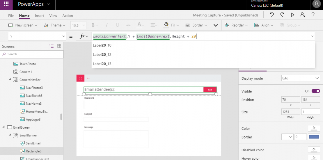
Here is an example (shown below) that demonstrates how you can set a relative position for controls in PowerApps. In this example, the Y coordinate is 20 pixels more than the bottom of the control that appears above it in the screen.

Be careful how you edit! If you move controls on the design surface with your mouse or arrow keys any code you wrote to relatively position them will disappear and the X and Y coordinates will become fixed.