Did you see the blog post on the Microsoft SharePoint Blog about the new SharePoint list View Formatter samples? We had fun building the samples in the weeks leading up to the Microsoft Ignite conference and I’d like to share what we learned.
In this article I’m going to dive into the sample code and show you how to implement responsive layouts with SharePoint View Formatters.
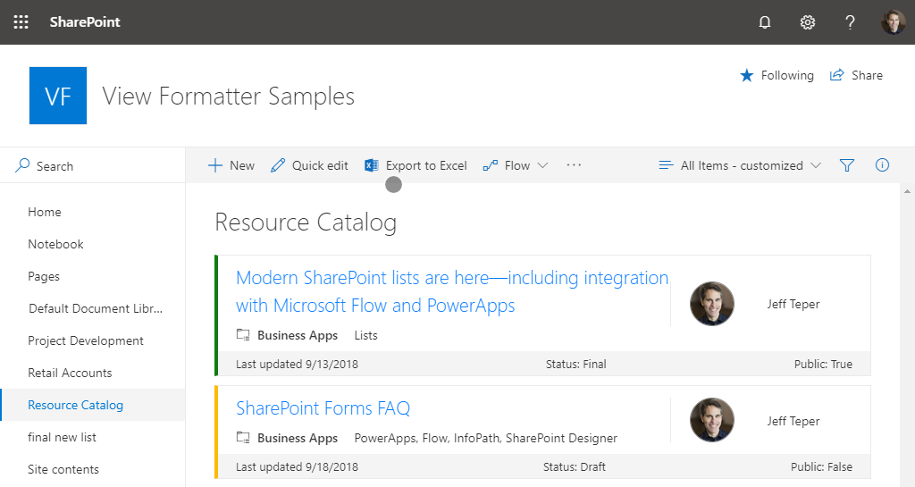
In this article, I’ll use the Resource Catalog sample as an example. The Resource Catalog sample looks like this in a desktop web browser. You can see it fills the screen from left to right.

In a tablet device it looks like this. The same layout is implemented and the content fits in the more narrow view port.
In mobile devices it looks like this. Here the layout changes and the content is displayed in a stacked layout.
Finally, what about when you add a web part to a SharePoint page to display the list? Here’s an example of what that looks like in a Modern Site. Notice the content fits nicely into the web part. In this example, the layout is the same as the tablet device example.
Note:It’s imperative that you think about the web part use case when making View Formatters. You never know when someone will add a web part to a page to display the lists you apply View Formatters to.
To implement the responsive design, use CSS and HTML in the View Formatter JSON. This is the same pattern used to create responsive web sites.
Looking closer at the code, you can see the top level HTML element used to define the outer container for each row (the DIV shown in the JSON View Formatter code in the green box shown below) uses a variety of CSS styles (shown the the gold box) to implement the responsive design.
Now, let’s connect the dots… In the image below you can see how the HTML and CSS Styles actually appear when they are rendered in the web page. Notice the green markup on the image that shows the HTML element (the DIV) in the code and in the web browser. Also, notice the gold markup on the image that shows the CSS classes that are applied to the DIV.
Now, taking it to the next level, you can see the children element in the View Formatter JSON (green box in image below). It also defines a DIV. This DIV is used to display the content for the top portion of each row. You will also see another children collection and additional elements below it. This screenshot is only a partial view of all the HTML elements in the sample, there are many children elements used to implement the user interface. Again, CSS styles (in the gold box) are used to implement the responsive behavior.
Just like I demonstrated earlier, here you can see what it looks like in the web browser and how the styles correlate to the HTML and CSS used to render the view.
To sum it all up, to create responsive SharePoint View Formatters simply use HTML and CSS just like you would to create a responsive web site.
Expert Tip: Use Office UI Fabric Styles to style the content whenever possible. This helps you match your user interface to Office 365. You will see in the samples where we used the Office UI Fabric Styles wherever we could. For example, we set the background color for the top level DIV with an Office UI Fabric Style, like this.
Keep in mind, depending on your design, you may have to use styles that are not part of the Office UI Fabric Styles, just like you see in this sample.
Happy coding!